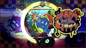
It is easy to see the inspiration behind the platforming mechanics in Heart Chain Kitty. Starting with a limited repertoire, the player slowly unlocks new abilities as level design gets more complex, there are several items to collect, and plenty of objectives to complete. Considering this title was developed by a very small team, credit should be given accordingly. Unfortunately, there is one aspect that negatively effects the entire experience and essentially makes the game unplayable – the visuals are easily some of the most disguising available and will make your eyes vomit.
Even if you can look beyond the horrible 3D character models that barely resemble anything more than a blob, the color scheme has a high probability of causing headaches and seizures – literally. The garish colors that litter each part of the environment look as if every color of paint was used at the same time and smeared randomly. In fact, the color scheme is so gross, you can’t get mad at it. Instead, it is rather impressive because I had no idea a game could look this intentionally ugly. It is nothing short of amazing! Simply just looking around, or swimming in water and watching the horrible colors mix, fade, and transition into itself is a sight to behold for all the wrong reasons. Like a train crash, you can’t help but look and stare and be amazed as your brain tries to comprehend what is happening. It doesn’t help that the game is also dimly lit which makes the gaudy colors smudge into your brain even more.
Not only are the visuals headache inducing, the level design might make you tear out your own hair in frustrating. For example, one of the early stages tasks the player to collect some coins before being allowed passage. Since I wanted to explore the 3D environment for potential secrets, I managed to fall in the water. The only way back to the main land was to circle the island for a tedious five minutes before making it back to solid ground. It was during this marathon swim that I was truly able to appreciate the wonderful visuals and all their pukey glory. By that time, I had a migraine and my patience reached rage quitting levels.
Because this is something so spectacular, I need to stress how bad the visuals are again. I am sorry, I cannot get over this. This game is not fun regardless, but I actually recommend purchasing it so you can experience how awful a game can look; it is like the inverse of the most amazing fireworks show you’ve ever seen. If the visuals were swapped with generic shapes and a basic color scheme was used, this would have been a rudimentary platformer at best if none of the remaining gameplay elements were tweaked. Instead, the visuals cannot be excused or overlooked. It makes the game unplayable and it is actually rather impressive for it.
SCORE: 2.5/10
Also Try: Poi: Explorer Edition
Don’t Forget About: the Spongebob Remastering
Wait For It: a complete HD Remake of Super Mario 64
By: Zachary Gasiorowski, Editor in Chief myGamer.com
Twitter: @ZackGaz
Please consider supporting me on Patreon.

0